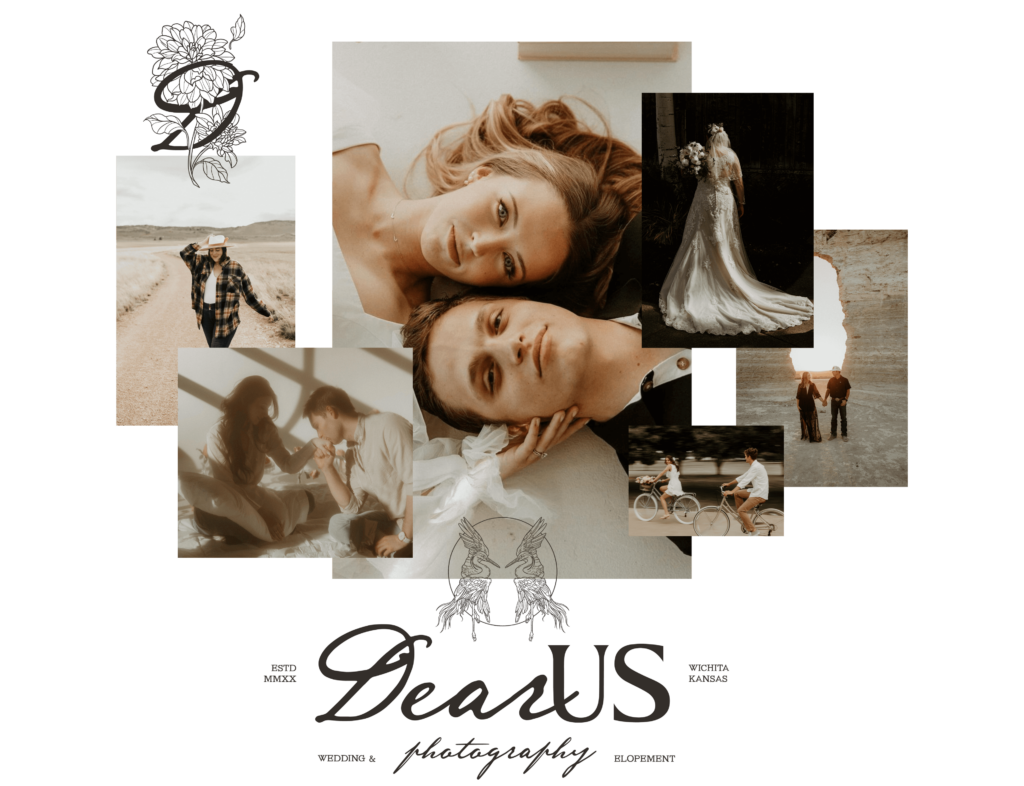
Poetic, Intimate Brand & Website Design for Wedding Photographer
When I set out to create a Wedding Photography brand and website design for Dear Us Photography, my goal was to design an experience that feels like stepping into a love letter—intimate, heartfelt, and timeless. Every couple’s story deserves to be captured with depth and warmth. That is exactly what Remy, the founder of Dear Us, brings to her work. I wanted this design to mirror her mission, inviting visitors to feel the same sense of nostalgia and beauty that her photography holds.
Client Overview: Embracing Love in its Most Vulnerable Form
For Remy, photography is more than images; it’s a safe space where couples can fully be themselves. This was key in shaping the brand’s identity. Her clients are drawn to her unique ability to capture unscripted moments that reveal the raw, wild beauty of love. Each image tells a story, and I wanted the website to reflect this emotional depth. An experience that allows clients to feel seen, celebrated, and understood.
The Client Experience: Capturing Connection, Cultivating Comfort
Creating a design that encapsulates Remy’s approach to her clients was essential. From the initial consultation to the final gallery reveal, her process is warm and personal, making couples feel cherished. I knew the design had to embody this same comforting presence. My goal was to help clients see that Dear Us Photography isn’t just about photos. It’s about creating a space where they can relax, be themselves, and experience each moment authentically.
Branding Design for Wedding Photographer
Brand Mission: Photography like a Written Love Letter
For Remy, each photograph is like a love letter, capturing moments with a cinematic and poetic lens. I crafted the brand’s visual language to reflect this mission, emphasizing earthy tones, nostalgic imagery, and textures that evoke a sense of timelessness. This is more than just documentation; it’s a way to honor each couple’s unique love story in a style that feels both beautifully real and cinematic.
Design Elements: Creating Romantic Cinematic Imagery
The brand’s visual style centers on warmth, romance, and nostalgia. I chose earthy tones and warm textures to make each element feel like a keepsake. This isn’t just about color—it’s about evoking emotion. The design approach was inspired by the idea that each moment Remy captures is like a still from a love story in motion, and I wanted the brand’s visuals to hold that same magic.
Custom Illustrations
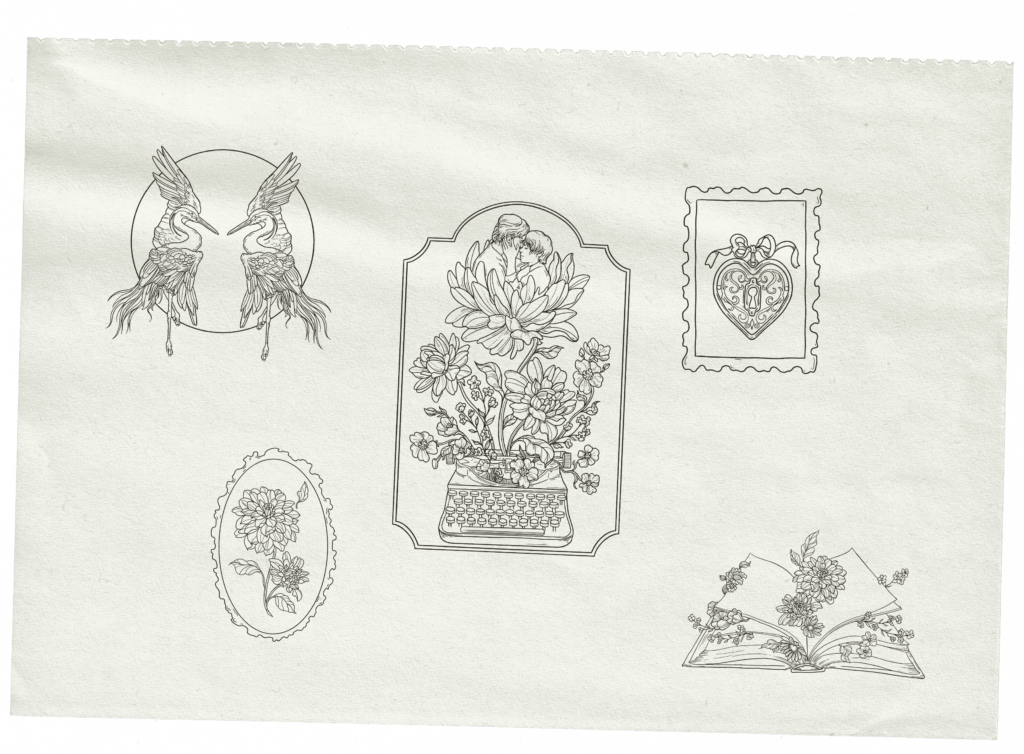
To bring an extra layer of depth and intimacy, I incorporated custom illustrations that align with Remy’s poetic aesthetic. Each piece tells a story on its own, enhancing the brand’s nostalgic feel:
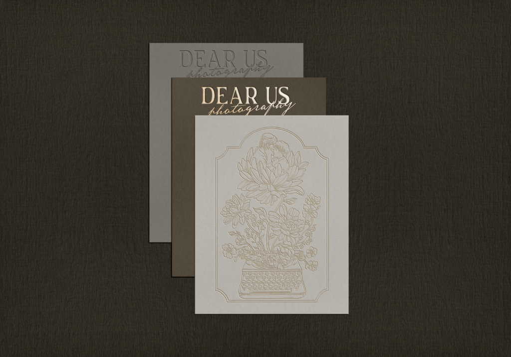
- Typewriter with Couple and Flowers: This illustration combines storytelling and growth, symbolizing how photography, like a love letter, captures moments as they blossom.
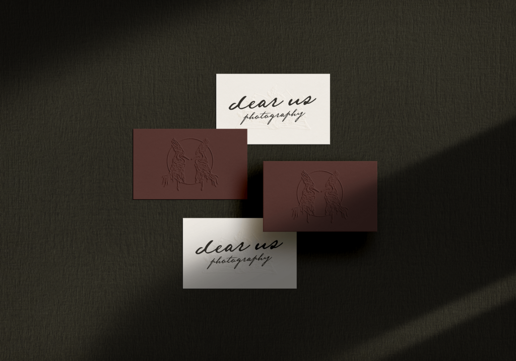
- Two Herons Facing Each Other: Herons symbolize love and partnership, a fitting motif that mirrors the essence of what Remy captures in her work.
- Heart Locket with Key: This piece speaks to the idea of treasured memories, representing the personal moments clients entrust to Remy.
- Open Book with Flowers: An open book filled with floral details symbolizes the unfolding of love stories, each chapter captured beautifully by Remy’s lens.
- Botanical Frame: Delicate flowers within a vintage-style frame add a touch of natural beauty, reinforcing the brand’s grounded and organic feel.
These illustrations serve as visual poetry, giving the brand a timeless, heartfelt presence that extends to social media and the website, enhancing the storytelling experience for clients.
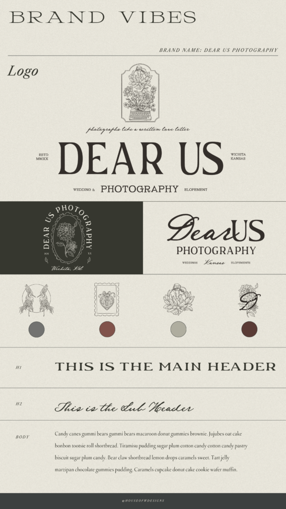
Logos
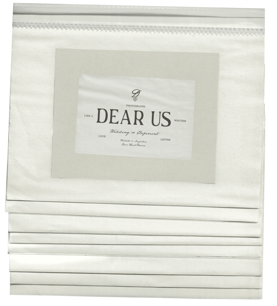
The logo suite offers versatility across different mediums, ensuring brand consistency while allowing flexibility:
- Primary Logo: The main logo provides a strong, memorable identity for the brand’s most prominent placements.
- Secondary Logo: A simplified version for smaller spaces, maintaining recognition without compromising on style.
- Submark: A minimalistic logo variation, ideal for social media icons, footers, and packaging, subtly reinforcing brand identity.
Each color was chosen to help clients feel at ease, inviting them into a world that feels honest and welcoming.
Colors
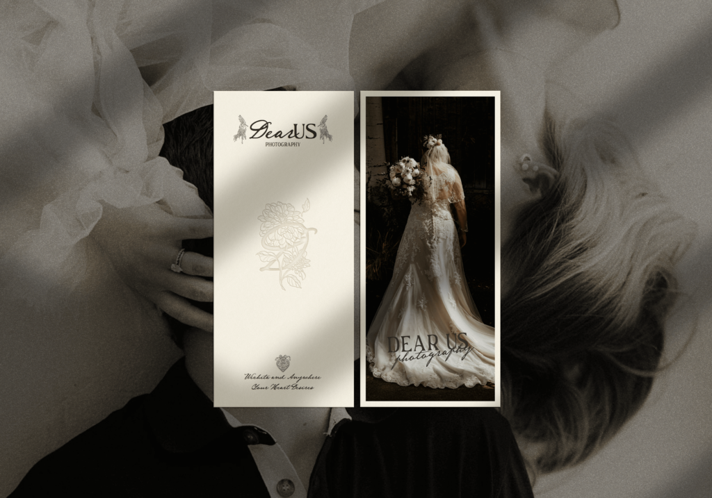
The color palette is rooted in earthy, calming tones that ground the brand in nature and nostalgia:
- Primary Colors: Rich, deep hues like dark walnut and rusted amber create warmth and stability, adding a timeless touch to the brand.
- Accent Colors: Sage green and blush sandstone bring softness and openness, perfect for background elements and gentle highlights.
- Supporting Colors: Light neutrals like wheat cream and light linen add balance, keeping the palette approachable and airy.
Fonts
I selected a font palette that enhances the brand’s poetic and intimate tone:
- Title Font: A bold typeface for headers, creating a strong visual anchor that exudes sophistication.
- Heading Font: With a vintage, romantic feel, this font brings an element of timelessness.
- Subheading Font: A typewriter-inspired style that adds authenticity and reflects the brand’s documentary approach.
- Paragraph Font: Clean and readable, ensuring clarity while maintaining a warm, inviting look.
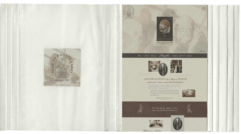
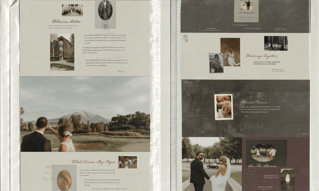
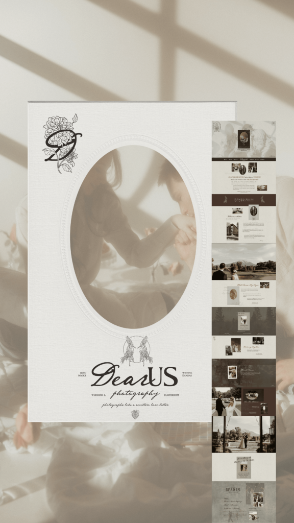
Showit Website Design
The Showit website design for Dear Us Photography is crafted to be nostalgic, intimate, and cinematic, just like Remy’s work. I wanted visitors to feel as if they’re stepping into a love letter, rich with warmth and timeless beauty. Earthy tones, elopement imagery, and vintage-inspired fonts create a soulful experience that goes beyond photography, inviting clients into a thoughtfully curated journey that feels uniquely their own.
Website Copywriting
The copy is crafted to speak directly to the hearts of couples, using poetic language that lets them feel seen and understood. It’s not just about capturing a moment; it’s about preserving the essence of love in its most vulnerable form. The website’s language guides visitors through a journey, assuring them that their unique story will be documented with care and artistry. This is more than a service—it’s an experience that promises memories infused with authenticity and a touch of magic.
Wedding Photographer Brand & Website Design
Final Thoughts: For Those Who Value Vulnerability & Connection
Dear Us Photography is for couples who crave more than traditional wedding photos. It’s for those who seek a poetic and authentic portrayal of their love. With every session, Remy invites her clients to embrace their story, creating images that feel like treasures to hold close. This wedding photography Brand and Website Design reflect that spirit. Giving clients a glimpse into a space where they can be fully seen, cherished, and celebrated.

Brand & Website Design for Wedding Photographer
Consistent branding across your website and marketing materials is essential for building a strong, memorable identity in photography. It creates recognition, as a cohesive use of logos, colors, and typography helps clients instantly connect your style with your name. A polished brand presence also builds trust, signaling professionalism and reliability. Effective branding connects with your ideal clients by reflecting your unique style and values, drawing in those who resonate with your vision.
In a competitive industry, strong branding sets you apart and showcases what makes your work distinctive. Investing in a custom web design that authentically represents your brand not only elevates your online presence but also positions you to make a lasting impact. If you’re ready to transform your website into a powerful extension of your brand, reach out to House of W Design for a Wedding Photography Brand and Website Design that’s as unique as you are.
XOXO,
Whitney
Feel inspired by this design? If so, you might enjoy: